
How to Improve Your Customers’ Checkout Experience Today
Over the years, marketers have been changing their tactics in response to the consumer. Nowadays, consumers are a lot savvier and are being conditioned by brands like Amazon to have certain expectations, especially in their checkout experience. So, what are we looking for when improving checkout experience?
In this webinar, Kath Pay, shares tips for what marketers can do to adapt to an increasingly savvy consumer base. Kath has been in the digital marketing space for 16 years.
Here’s what someone who lives and breathes marketing has to say about how to improve your customers’ checkout experience:
FBM Theory
The Fogg Behavior Model, created by Dr. BJ Fogg, shows that we as consumers need to have three factors in place in order for us to make the conversion: motivation, ability and trigger.
Key #1: Motivation
Build up their motivation. Building up customers’ motivation is really key, because what we want to do here is to ensure that we’re making the most of this opportunity. This motivation means that we have to engage them and reducing all the barriers of conversion. The more we can engage, the more we can be compelling and sell to them.
Make it easy to do so. This is the reduction to the barriers of conversion. This is making the journey on your e-commerce site as easy as possible and frictionless.
Ask for it at the right time. This is asking for the conversion at the right time: using the right copy, using the right call to action, etc.
4 Different Personality Patterns for improving checkout experiences.
In her research, Kath has found that these four personality traits are fundamental to we as humans. As marketers, we have to understand and work with these as well. Similar to this model, there are a number of brands or companies like Myers-Briggs that goes into your company and tells you what personality traits there are.
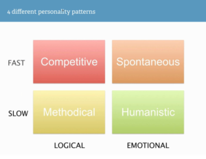
‘Competitive’ and ‘Spontaneous’ are the fast decision makers. Because of that, they don’t actually scroll. ‘Methodical’ and ‘Humanistic’ are slow decision makers that take their time and investigate the situation longer. From top-bottom, ‘Competitive’ and ‘Methodical’ are logical thinkers. They want to see the facts and understand what your product or service is all about. ‘Spontaneous’ and ‘Humanistic’ people make decisions most based upon the emotions.
Leverage Human Traits
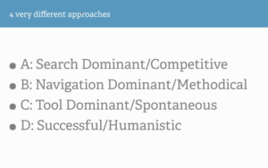
Back in 2007, Jakob Nielsen decided to understand whether we all use the web in the same way. Do we all go to accomplish a certain task in a certain pattern? No—in fact, Nielsen found there were four types of web users. Nielsen gave everyone the same task and tracked them. Those four different web users mapped back to the four different web personalities above:
These personalities do actually designate how we are going to navigate on the web. We as marketers need to understand this and use this information to make users’ experience better.
Competitive
These people are fast-paced decision-makers and logically oriented. They want things very quickly and are the most difficult to sell to out of the four personality traits. This doesn’t mean that you should give up on them. It just means that you need to put things in place to appeal to them.
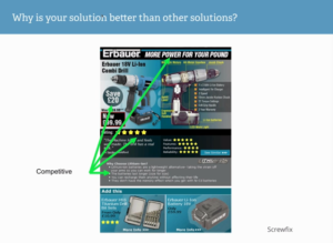
Here we can see what Screwfix did. They actually created an email with these four different personalities in mind. You don’t need to create four different versions of your website. What Kath is saying is: understand that the ‘Competitive’ and ‘Spontaneous’ don’t really scroll, so try to have as many points that will resonate with them and the call to action at the top. The word ‘Power’, the five-star rating and the ‘Save 20 pounds’ at the top really resonates to the ‘Competitive’. The other two are more likely to scroll down.
Methodical
Once again, the ‘Methodical’ are those who have slow-paced decision-making and are logically oriented.
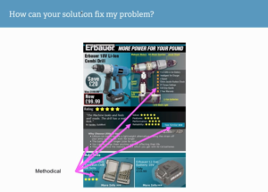
In this same advertisement, the ‘Methodical’ will look at all the bullet points to understand the values, features and performance. They’ll do all of their research online and will be quite happy to do so. On email, they are the ones most likely to click through. A lot of the points that appeal to them in this graphic are below the fold.
Spontaneous
The ‘Spontaneous’ are those who make fast-paced decisions and are emotionally oriented. They are easy to sell to and are ones that buys impulsively. If you say ‘exclusive offer just for you’, they’re there.
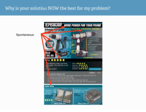
The majority of the elements aimed for the ‘Spontaneous’ are above the fold. The title is very sexy, because that’s what they’re looking at. They’re looking at the imagery, the five-star rating and the ‘Add this’—things that could be making their lives easier, they love. If you could streamline the process for them and have great customer service, they’ll love it.
Humanistic
The ‘Humanistic’ are slow at making decisions and are emotionally oriented. These are the guys that want to find out about you and about your other users.
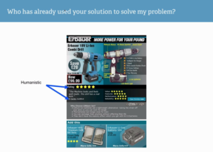
Users want to know: who else like me is using your product and how can I find out more about that? The ratings and testimonials really resonate with these guys.
Use design elements to help them make a decision
The next thing we need to look at is how we can start to use both implicit and explicit design queues to help us with the conversion.
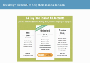
Here is a really nice example from Typepad. What they’ve done here is that users are given three options. They are using the Goldilocks Theory, which says that when you package things up in threes, conversions are exponentially higher. You’ll find more often than not, brands create three price points to leverage this phenomenon.
The middle one, as you can see, says ‘Unlimited’. It has a big, orange call to action, which makes it pop out. On the top left-hand corner, we have social proof showing it’s the ‘Most Popular’ option. The most obvious design element is that it’s pushed out subtlety. What they’re doing here is that they know this is their most popular package and they are actually helping you make the decision. If users are given too many options, they won’t make a decision because they are overwhelmed.
Loss Aversion
Another cognitive bias is loss aversion. It refers to people’s tendency to strongly prefer avoiding losses to acquiring gains. There are two main things that motivate people: one is to gain pleasure and the second is to avoid distress or pain. Everything stems from either of these two. Loss aversion stems from the second one. Some studies suggest that losses are twice as powerful, psychologically, as gains. That’s very interesting for us to look at as marketers.
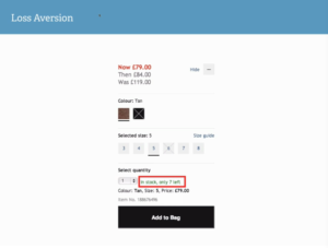
Highlighted here in red, you can see the marketer is drawing on loss aversion. You can see this all the time, on booking.com or any sort of accommodation sites. Honestly, it triggers people and it works. This is leveraging on social proof as well. You can also see an example of the ‘Anchoring Effect’ on the top where prices are written out at ‘Now’, ‘Then’ and ‘Was’. Again, this is the first initial price given to us that sets an anchoring in our mind. Now that it’s a reduced price, our motivation for buying is escalated.
Address their concerns
This is a huge motivating factor when we’re talking about the e-commerce journey. What causes people to abandon during a journey?
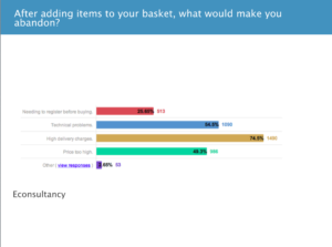
In this study by Econsultancy, we can see that the highest one is high delivery charges, then the need to register before buying. We need to be addressing these concerns and need to reassure customers as much as possible. This is an online purchase, not an in-store one where you can talk to a sales representative.
Here’s another example:
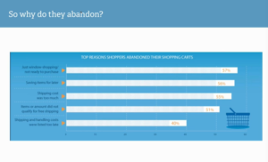
The top reason here is that users are not ready to purchase, they’re saving items for later and shipping cost was too much. These two studies show that shipping cost is a constant issue and needs to be something addressed early on in the process. Traditionally, we’ve always left that to the last step, which turns people off.
Here, we have a nice example that gives users delivery options from the beginning of the journey.
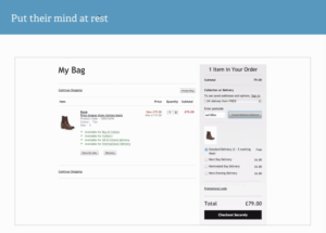
What they’re doing is for the checkout experience, before you even hit the checkout process, they are helping customers in the process by showing delivery charges and making it as frictionless as possible.
To learn about ability and trigger in the customer checkout experience and how to leverage both, watch the webinar here.
Originally posted on Kissmetrics
Creating a seamless and efficient checkout experience is crucial for reducing cart abandonment and enhancing customer satisfaction. By understanding customer behavior and implementing strategic optimizations, you can significantly improve the checkout process and drive higher conversions. This article offers practical tips and insights to help you enhance your customers’ checkout experience.
Ready to optimise your checkout process and boost conversions? Contact Holistic Email Marketing today for expert advice on improving your customers’ checkout experience.