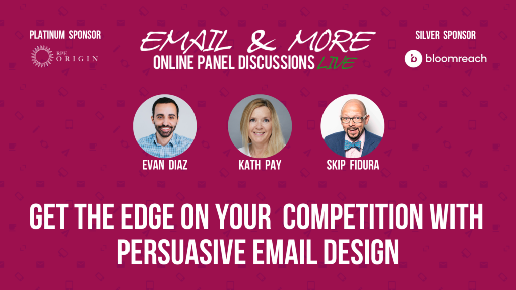
‘Get the Edge on Your Competition with Persuasive Design’ – Insights from Email & More
“Email is one of the first impressions that people will have of your company. It’s like going to a new doctor whose office plants are dead. What impression does that give?,” panel guest Evan Diaz said about email’s role as an important brand ambassador.
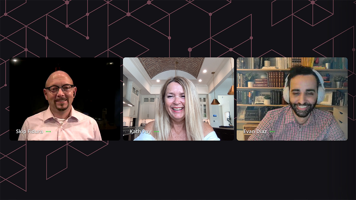
Evan joined moderator Skip Fidura and Holistic CEO Kath Pay on 19th Sept. for Email & More: Get the Edge on Your Competition with Persuasive Email Design.
Persuasion is central to email marketing, Evan said. “If we’re not persuading someone to do something, then why are we sending the email? Persuading someone, changing their mind, that’s the entire point of the email.”
Building the 3 pillars of persuasive email design
Email marketing grew out of pre-digital direct mail ideas and practices. When they took on email, many teams and organisations stuck to what they knew from the old way and overlooked the potential that came with the new technology.
“[Marketers] decided to focus purely on aesthetics,” Kath said. “So often when you’re talking about designing for email, it’s about designing to make sure it’s on brand. To make it pretty rather than to have it be effective.”
Appearances matter, of course. “I’m not saying you don’t design for aesthetics,” Kath continued. “That’s why you have fantastic designers like Evan work on it. But you need the persuasive elements within it to help with conversions. It’s about getting that balance between persuasion and the aesthetics.”
Persuasion and aesthetics are two pillars of a persuasive email. The third is technical, built on email’s realities and limitations. Email is an older technology and hasn’t advanced much since its commercial launch in the 1990s. This can challenge modern designers.
“When coding emails you have to work like it’s 1992,” Evan said. “Basically, improvements are hacks that try to make the software do something it wasn’t intended to.” This is especially a challenge when people are getting their emails on so many different clients (Gmail, Outlook, Yahoo, AOL, etc.) and devices like mobiles and tablets.
That’s why designers must understand email’s technical aspects. “It’s hugely beneficial because you can be designing with the restrictions you have in mind, as opposed to working with a designer who doesn’t know and understand the limitations of email,” he said.
“They design something amazing, but then the coder is often left struggling to make it happen. This matters as an email that doesn’t work won’t persuade.”

Relying on images alone is lazy and dangerous
“I’ve recently done an audit of five retail brands, and I’m shocked that in 2023 they’re all creating their emails just out of images,” Kath said. “Many companies are too reliant on their brand to convince people to download. But images don’t always download automatically, and people may not be bothered to click to download them, or on some setups may be unable to.”
Evan agreed. “If I only have one click out of a contact before they lose interest, do I want it to be ‘go to my landing page’ or ‘download images’? Images are great, but they’re a lazy way to create an entire email.”
3 tips for creating persuasive design
1. Use images, colours and text to direct the eye
Images can be a hugely powerful tool for showing customers what to look at. “We look to people, we look to their faces, we look to their eyes and where their fingers are pointing. And even though we’re not consciously thinking our eyes are drawn there,” Kath said. Text layout and colour also can direct attention where you want it.
2. Use psychological effects.
We can use what we know about people’s behaviour and thinking to nudge them into acting. These psychological effects include:
- Anchor effect: Declaring something to have a particular value before offering it again at a lower price; e.g. “Was $299, now $80!”
- Von Restorff Effect: The feature that sticks out is more likely to be noticed and remembered. For example, a call to action stands out more when it is the only feature coloured red in an email that is otherwise mostly blue.
- Cognitive biases: People respond to cognitive biases like FOMO (fear of missing out), scarcity and social proof. Although they are powerful, Kath cautioned, a marketer must use them mindfully. The goal is always to help a customer act. “There is a fine line between persuasion and coercion,” she said.
3. Prioritise email function.
Most email marketing messages try to persuade recipients to click on a button to claim the offer or register their interest, so they need an effective call to action. Giving recipients multiple ways to act will drive engagement and conversions.
For example, link header images to the promotion to accommodate users, especially mobile viewers, who click on them instead of the CTA button.
“Some people love clicking on images. Some people love clicking on links. Some people love clicking on buttons.” Evan said. “Let’s give them all of the options and have them going to the same place we need them to.”

Audience Q&A: What if my brand font is not a web-safe font?
“If it is a brand font, go ahead and save it as an image,” Evan said. “Have it as the exception rather than the rule. But where that font is, add the font text as alt text. You can style the alt text to look similar and get it about 70% of the way to look similar. Even with images off you can still get it to look pretty close to what you want.”
“The only person that’s going to notice is the brand person at your company,” Skip said. “That’s when you go to them and say ‘The font you picked doesn’t work on the web, email, or PowerPoint. Pick a different font.'”
This disconnect can help you make the case for email testing, Kath said. “This is when you’re finding out whether your brand is valuing aesthetics over conversions and that’s when you actually have to do a side-by-side test. That’s when they realise that focusing only on aesthetics is costing us in lost revenue.”
Final thoughts on designing persuasive emails
Kath: “Build yourself a master template and put the necessary time and resources into getting it right. You need to check it on as many clients and devices as possible to ensure it renders well across all platforms. Then you can be using modules taken from the master template and you can be assured that you’re starting off at a good point because you’ve already spent a lot of time and effort in render-testing it”.
Evan: “If your designers are aware of the limitations of email you’re going to save yourself a lot of headaches. You’re not going to design yourself into a corner that you have to figure out later. If you’re going to use fancy images or AMPscript, make sure you have time before you have to deliver before you try to include these things. A lot of these extra bells and whistles don’t move the bar that much. Most people really need to focus on asking ‘Is this email functional?'”
Want to learn more about email and persuasive design? Watch the full episode at your convenience. Search the complete archive of Email & More Seasons 1-4 for discussions on every aspect of successful email marketing.
We’d like to thank our Platinum Sponsor RPEOrigin and Silver Sponsor Bloomreach for their support in making Email & More season 4 possible.